Monday, August 29, 2011
Tips on Painting from a Photograph – Part 3
In this last part I wanted to mention a few points that are important if you are painting the picture for someone else.
If you are given a photo and asked to paint it then be sure to check what the other person expects.
Expections
1. Perhaps they really want a painting of the photo just as it is, in which case you will have to try and keep the picture fairly true to the photo.
2. They may say that the photo is just a starting point but they want the final piece to be recognisable as the photo. In this case you have a bit more flexibility with the composition and colour of the painting.
3. Or they may say that they are happy for you to paint your version of the photo. This will give you the most freedom with the choices you make.
It is always best to discuss what they expect the final painting to look like. This will avoid disappointment for you both!
An Example
I painted a pet portrait from a very small photo (the head in the photo was about half an inch by half an inch) and felt that the final painting was a good likeness. Although the client was happy with the painting she said that it was her partner’s dog and she had never seen it when it was younger. The dog was going grey and this was not apparent due to the size of the photo.
For myself - I prefer to remember pets in their prime, looking healthy and alert. But I should have discussed the painting more than I had. Maybe a painting of the dog looking older would have been more appreciated by the owner.


Tuesday, June 07, 2011
Tips on Painting from a Photograph – Part 2
Here is Part 2 of Tips on Painting from a Photograph. It looks at the composition of your final painting and considers some of the options you have.
You don't need to paint a picture to exactly match the photograph. In Part 1 we talked about choosing just a section of the original photo and not the whole of it. The composition of the final painting is the main subject of this article.
Although you're using the photo for your inspiration it's still necessary to consider the composition of the final painting.
Here are a few points to think about.
What is the focal point?
Where is it placed? (It is better to avoid putting it in the centre.)
You can move it to a better area if you want.
Are there objects to lead the eye into the painting?
These could be paths, branches, or shapes to lead the eye in.
What about the colours? You could change a landscape to a different time of day or a different time of year?
Instead of mid-day you could have a sunset, instead of the bare branches of winter you could have green leaves or even autumnal leaves.
Consider the contrast between the tones used in the different areas too.
Again you do not need to follow those in the photo.
Perhaps you want to highlight a contrast between some light and dark areas of the picture.
You can use the photo as a starting point for your painting.
But if the final painting is for someone else they may want and expect it to look like the photo.
However you still have the option to change things to improve the composition of the final picture. For example missing out a power line in a landscape or changing the background in a portrait.
You don't need to paint a picture to exactly match the photograph. In Part 1 we talked about choosing just a section of the original photo and not the whole of it. The composition of the final painting is the main subject of this article.
Although you're using the photo for your inspiration it's still necessary to consider the composition of the final painting.
Here are a few points to think about.
What is the focal point?
Where is it placed? (It is better to avoid putting it in the centre.)
You can move it to a better area if you want.
Are there objects to lead the eye into the painting?
These could be paths, branches, or shapes to lead the eye in.
What about the colours? You could change a landscape to a different time of day or a different time of year?
Instead of mid-day you could have a sunset, instead of the bare branches of winter you could have green leaves or even autumnal leaves.
Consider the contrast between the tones used in the different areas too.
Again you do not need to follow those in the photo.
Perhaps you want to highlight a contrast between some light and dark areas of the picture.
You can use the photo as a starting point for your painting.
But if the final painting is for someone else they may want and expect it to look like the photo.
However you still have the option to change things to improve the composition of the final picture. For example missing out a power line in a landscape or changing the background in a portrait.
Wednesday, March 16, 2011
Tips on Painting from a Photograph – Part 1
Photographs are very handy reference materials. When you decide to paint a picture you can use a photo and you don't need to worry about the weather or time of day. I don't like to paint when it is raining and obviously night time painting sessions can be a challenge. ;-)
However when you have photos to use you can paint whenever the mood takes you.
There are really two main ways to use photos.
1. Using just one photo and painting your version of the scene
2. Using several photos and choosing sections from them to compose a different scene altogether
One main photo
When you are using one main photo for the painting there are a few things you may want to consider.
You don't need to use all of the things from the photo. A photographer has no choice when he takes a picture, but you don't have this problem.
If your photo has a lot of detail you may choose to just use a section of the photo for the painting. You don't have to use the entire photo – just use your artistic licence and select a part of the scene to use.
Often less is more in a painting. If the foreground is complicated and detailed you might want to keep rest of the painting simple.
Simplify for impact.
Putting the majority of the detail in the foreground will help to give depth to your final piece. The further away a thing is the less detail you can see, so simplify the middle and distant areas in your painting to help give it depth.
Tips on Painting from a Photograph – Part 2 will discuss how the composition of the painting can be improved.
However when you have photos to use you can paint whenever the mood takes you.
There are really two main ways to use photos.
1. Using just one photo and painting your version of the scene
2. Using several photos and choosing sections from them to compose a different scene altogether
One main photo
When you are using one main photo for the painting there are a few things you may want to consider.
You don't need to use all of the things from the photo. A photographer has no choice when he takes a picture, but you don't have this problem.
If your photo has a lot of detail you may choose to just use a section of the photo for the painting. You don't have to use the entire photo – just use your artistic licence and select a part of the scene to use.
Often less is more in a painting. If the foreground is complicated and detailed you might want to keep rest of the painting simple.
Simplify for impact.
Putting the majority of the detail in the foreground will help to give depth to your final piece. The further away a thing is the less detail you can see, so simplify the middle and distant areas in your painting to help give it depth.
Tips on Painting from a Photograph – Part 2 will discuss how the composition of the painting can be improved.
Tuesday, November 30, 2010
How to Make Your Own Rake or Comb Brushes
Rake or comb brushes are very handy when painting textured effects. These brushes have been cut with gaps between the bristles so that they produce grass like effects. They are really convenient when you want to paint rows of lines quickly and easily.
I find them useful for painting the fur in pet portraits.
However the rake brushes I have do have one problem. The spaces between the bristles are all the same size. This makes them excellent for parallel line areas, but not so good for grassy areas where you want some variety in the brush strokes.
I do have one rake brush that has irregular spaces but the majority of the rake brushes seem to have uniform spacing.

So I decided to experiment
I trimmed some old brushes to see how that would work. Don't use new brushes, but if you have some old brushes that are past their best this could be a good project.
As you can see from the photo I cut the bristles to give uneven spaces.
How to make your own
It is probably easier to do this with flat brushes rather than round brushes, although I tried both. Trim the brush across the width of the brush head. You are trying for a thin line of bristles across the width of the brush; this will avoid the final brush being overloaded with paint.
Then cut into the brush head to give the spaces between the bristles. This is a bit like when a hairdresser is making choppy layers in a hair style.
Test your newly trimmed brush to check that you are happy with the effect. If you aren't pleased with it then dry the brush on a piece of paper towel and re-cut it. Repeat this stage until you have a successful rake brush.
When to use them
If you're only painting a small area of texture it'll be easier to just paint it in using a small brush. However when you want to texture a large area it'll be quicker to use this type of brush and you can add several lines with just one brush stroke.
Having made your own brush you will have a more random look to the texture too.
I find them useful for painting the fur in pet portraits.
However the rake brushes I have do have one problem. The spaces between the bristles are all the same size. This makes them excellent for parallel line areas, but not so good for grassy areas where you want some variety in the brush strokes.
I do have one rake brush that has irregular spaces but the majority of the rake brushes seem to have uniform spacing.
So I decided to experiment
I trimmed some old brushes to see how that would work. Don't use new brushes, but if you have some old brushes that are past their best this could be a good project.
As you can see from the photo I cut the bristles to give uneven spaces.
How to make your own
It is probably easier to do this with flat brushes rather than round brushes, although I tried both. Trim the brush across the width of the brush head. You are trying for a thin line of bristles across the width of the brush; this will avoid the final brush being overloaded with paint.
Then cut into the brush head to give the spaces between the bristles. This is a bit like when a hairdresser is making choppy layers in a hair style.
Test your newly trimmed brush to check that you are happy with the effect. If you aren't pleased with it then dry the brush on a piece of paper towel and re-cut it. Repeat this stage until you have a successful rake brush.
When to use them
If you're only painting a small area of texture it'll be easier to just paint it in using a small brush. However when you want to texture a large area it'll be quicker to use this type of brush and you can add several lines with just one brush stroke.
Having made your own brush you will have a more random look to the texture too.
Monday, October 25, 2010
Using Glow in the Dark Paint in a Painting
The last posting mentioned that the landscape painting had another secret. As you now know from the title of this post – it included some glow-in-the-dark paint.
I bought a small container from eBay and didn’t know quite what to expect.
However I like to experiment with new materials…
My first try
My first project was to use it on a lighthouse window in a picture I had previously painted. I thought that if the lighthouse window would glow in the dark it would add an interesting dimension to the picture.


The picture is displayed in quite a dark hallway and I was disappointed that there was no glow. I applied several layers of the paint but there wasn’t any improvement.
I have it so I will use it!
Seeing as I had most of the paint left I decided to give it another try. The hallway is fairly dark and maybe the paint wasn’t getting enough light in that position.
This time I applied the paint to the landscape so that the glow would look like a shimmer in the sky that was reflected on the watery section in the centre of the picture, indicated by the marked area in the photo.

As in my first attempt, I applied a few layers of the glow-in-the-dark paint. This is recommended in the instructions that came with it.
Display and Glow
I hung the painting and forgot about it. But this time it worked. :-)
As soon as the lights were out the areas that I used the glow in the dark paint on gave off a slight glow – enough for me to see even without my glasses on!
The picture is displayed on the wall on the same side of the bedroom as the digital clock. I don’t know if this gives enough light to make a difference or not, I only know that it works there.
Green Might be Better?
According to the website the brightest glow comes from the green paint. The one I have is white, which is second in their table.
I can imagine painting a sunset with over hanging trees and using the green on the leaves for an interesting glow look. I might get around to that some time.
For the Full Range
You don't need to look on eBay for this paint supplier. They have a website at www.kilabitzzz.co.uk with their full range.
They also sell some other interesting paints. There is one for UV lights and a temperature changing one too. If you're looking for something different it may be worth a look.
I bought a small container from eBay and didn’t know quite what to expect.
However I like to experiment with new materials…
My first try
My first project was to use it on a lighthouse window in a picture I had previously painted. I thought that if the lighthouse window would glow in the dark it would add an interesting dimension to the picture.
The picture is displayed in quite a dark hallway and I was disappointed that there was no glow. I applied several layers of the paint but there wasn’t any improvement.
I have it so I will use it!
Seeing as I had most of the paint left I decided to give it another try. The hallway is fairly dark and maybe the paint wasn’t getting enough light in that position.
This time I applied the paint to the landscape so that the glow would look like a shimmer in the sky that was reflected on the watery section in the centre of the picture, indicated by the marked area in the photo.
As in my first attempt, I applied a few layers of the glow-in-the-dark paint. This is recommended in the instructions that came with it.
Display and Glow
I hung the painting and forgot about it. But this time it worked. :-)
As soon as the lights were out the areas that I used the glow in the dark paint on gave off a slight glow – enough for me to see even without my glasses on!
The picture is displayed on the wall on the same side of the bedroom as the digital clock. I don’t know if this gives enough light to make a difference or not, I only know that it works there.
Green Might be Better?
According to the website the brightest glow comes from the green paint. The one I have is white, which is second in their table.
I can imagine painting a sunset with over hanging trees and using the green on the leaves for an interesting glow look. I might get around to that some time.
For the Full Range
You don't need to look on eBay for this paint supplier. They have a website at www.kilabitzzz.co.uk with their full range.
They also sell some other interesting paints. There is one for UV lights and a temperature changing one too. If you're looking for something different it may be worth a look.
Wednesday, September 22, 2010
How You can Paint Your Own Colour Matched Artwork (Part 2)
This is the second part of painting artwork which includes the colours used in your home furnishings.
This topic is covered in the free report that I give away (the link is above). However I always think that it's clearer to see some actual examples.
As in the previous post the colours used in this painting match the bed cover in our bedroom. This post looks at another style of painting using the same colours as before.

Recap on the Colours in the Furnishings
As you can see from the photo the bed cover is a checked design with stone and dark red in the pattern. Trying to buy artwork with these particular colours in it would be very awkward to find.
I used a couple of small pots of pre-mixed colour. As I was going to paint a couple of pictures it was easier to use pre-mixed colours.

The Style of this Picture
As before this picture was painted onto a stretched canvas. The style of this picture is a fairly traditional landscape style.
And as previously the sky was painted using the stone colour with some white for a cloud effect.
The furthest away hills were a mix of the stone and red colours and painted with quite a lot of water for a pale tone.
Limited Palette
This picture is an example of painting with a limited number of colours or a limited palette. I really like these types of pictures and find the final effect is very pleasing and harmonious.
Surprise Element
However that's not the full story of this picture. There is a surprise element to this painting that I’ll tell you about in next month’s posting.
This topic is covered in the free report that I give away (the link is above). However I always think that it's clearer to see some actual examples.
As in the previous post the colours used in this painting match the bed cover in our bedroom. This post looks at another style of painting using the same colours as before.
Recap on the Colours in the Furnishings
As you can see from the photo the bed cover is a checked design with stone and dark red in the pattern. Trying to buy artwork with these particular colours in it would be very awkward to find.
I used a couple of small pots of pre-mixed colour. As I was going to paint a couple of pictures it was easier to use pre-mixed colours.

The Style of this Picture
As before this picture was painted onto a stretched canvas. The style of this picture is a fairly traditional landscape style.
And as previously the sky was painted using the stone colour with some white for a cloud effect.
The furthest away hills were a mix of the stone and red colours and painted with quite a lot of water for a pale tone.
TOP TIP - If the tone isn't pale enough you can always add some white to the mix, or paint over the dried section with watery white to make it lighter.
The layers of hills coming towards the foreground used more of the red, as well as darker tones to give a feeling of depth.
In the Foreground
The foreground was straight red and some areas were painted with thicker paint (you can use several coats) to give extra detail to this area.
The area in the centre had some of the white and a little of the stone colour added to give the indication of water.
I added a little blue to the red in a few of the foreground areas to give some darker tones which give a nice contrast to the rest of the picture.
The layers of hills coming towards the foreground used more of the red, as well as darker tones to give a feeling of depth.
In the Foreground
The foreground was straight red and some areas were painted with thicker paint (you can use several coats) to give extra detail to this area.
The area in the centre had some of the white and a little of the stone colour added to give the indication of water.
I added a little blue to the red in a few of the foreground areas to give some darker tones which give a nice contrast to the rest of the picture.
Limited Palette
This picture is an example of painting with a limited number of colours or a limited palette. I really like these types of pictures and find the final effect is very pleasing and harmonious.
Surprise Element
However that's not the full story of this picture. There is a surprise element to this painting that I’ll tell you about in next month’s posting.
Wednesday, August 25, 2010
How You can Paint Your Own Colour Matched Artwork (Part 1)
Painting artwork that includes the colours used in your home furnishings is a popular project.
It is covered in the free report that I give away (the link is above). However it is always interesting to see some actual examples.
I'm going to show you a couple of examples of pictures I've painted to match the bed cover in our bedroom. This post looks at one style of painting and the next post, which will be in about a month, will show a different style of painting. Both will be using the same colours to paint the pictures. These colours have been chosen to match the fabric of the bed cover.

The Colours in the Furnishings
As you can see from the photo the bed cover is a checked design with stone and dark red in the pattern. Trying to buy artwork with these particular colours in it would be fairly difficult. Also I wanted to keep the colours in the bedroom limited as I find that more restful.
Rather than mix up the colours myself I decided to buy a couple of small pots of pre-mixed acrylic colour. There are a couple of reasons for this.
Firstly I was going to paint a couple of pictures, so mixing up exactly matching colours for both of the pictures was going to be a challenge. (I wasn’t going to be painting them at the same time.)
Secondly when I was looking at the range of stone colours I realised that some shades looked a lot better with the dark red than others. So it was easier to buy my favourite shade.

The Style of the Picture
When using more unusual colour combinations it is often easier to go for a more graphic style of painting rather than something that it too realistic looking. Therefore for the first picture I decided to do a simple sunset, or moon set :-) , picture with some palm trees. This was painted on a stretched canvas.
How to Paint It
I started with a rough sketch to place the sun and trees where I wanted them.
Then I drew around a large plate for a circle for the sun. The rest of the picture was lightly drawn on.
Top Tip - Remember that once you paint over the surface with acrylics you will not be able to erase the pencil marks. Remove any unwanted marks before you start to paint.
I painted in the sun with Cadmium Yellow and Titanium White. Once it had dried I painted in the sky with the stone colour, adding white to give some cloud effect areas.
The edge between the sun and sky can be repainted to tidy it up once both sections are completely dry.
I used the dark red to paint in the palm trees and foreground. This can be painted in several layers. Extra layers will make the colour look a bit darker too.
Adding additional details to the foreground area helps to add interest and depth to the picture.
Other Ideas
The contrast between the light area of the sky and the darker silhouette of the trees and foreground is handy for this type of colour matched artwork.
Of course you can use other subjects in a similar way. You could use the silhouette shape of anything you like. For example a bridge, city skyline, hills, and so on. Perhaps even a shape taken from the patterns in your furnishings.
Part 2
Next time I will be talking about the other painting which uses the same colours but with a different style and look.
It is covered in the free report that I give away (the link is above). However it is always interesting to see some actual examples.
I'm going to show you a couple of examples of pictures I've painted to match the bed cover in our bedroom. This post looks at one style of painting and the next post, which will be in about a month, will show a different style of painting. Both will be using the same colours to paint the pictures. These colours have been chosen to match the fabric of the bed cover.


The Colours in the Furnishings
As you can see from the photo the bed cover is a checked design with stone and dark red in the pattern. Trying to buy artwork with these particular colours in it would be fairly difficult. Also I wanted to keep the colours in the bedroom limited as I find that more restful.
Rather than mix up the colours myself I decided to buy a couple of small pots of pre-mixed acrylic colour. There are a couple of reasons for this.
Firstly I was going to paint a couple of pictures, so mixing up exactly matching colours for both of the pictures was going to be a challenge. (I wasn’t going to be painting them at the same time.)
Secondly when I was looking at the range of stone colours I realised that some shades looked a lot better with the dark red than others. So it was easier to buy my favourite shade.

The Style of the Picture
When using more unusual colour combinations it is often easier to go for a more graphic style of painting rather than something that it too realistic looking. Therefore for the first picture I decided to do a simple sunset, or moon set :-) , picture with some palm trees. This was painted on a stretched canvas.
How to Paint It
I started with a rough sketch to place the sun and trees where I wanted them.
Then I drew around a large plate for a circle for the sun. The rest of the picture was lightly drawn on.
Top Tip - Remember that once you paint over the surface with acrylics you will not be able to erase the pencil marks. Remove any unwanted marks before you start to paint.
I painted in the sun with Cadmium Yellow and Titanium White. Once it had dried I painted in the sky with the stone colour, adding white to give some cloud effect areas.
The edge between the sun and sky can be repainted to tidy it up once both sections are completely dry.
I used the dark red to paint in the palm trees and foreground. This can be painted in several layers. Extra layers will make the colour look a bit darker too.
Adding additional details to the foreground area helps to add interest and depth to the picture.
Other Ideas
The contrast between the light area of the sky and the darker silhouette of the trees and foreground is handy for this type of colour matched artwork.
Of course you can use other subjects in a similar way. You could use the silhouette shape of anything you like. For example a bridge, city skyline, hills, and so on. Perhaps even a shape taken from the patterns in your furnishings.
Part 2
Next time I will be talking about the other painting which uses the same colours but with a different style and look.
.
Wednesday, June 30, 2010
Newsletter Readers
If you are one of my newsletter readers you may be wondering why you haven't received a newsletter for June.
Unfortunately I am having problems with my provider for this. I'm going to need to find another supplier for this service.
I intend to find a good one and then restart the newsletter. You will eventually receive another Acrylic Painting Course Newsletter.
I appreciate your patience. :-)
Unfortunately I am having problems with my provider for this. I'm going to need to find another supplier for this service.
I intend to find a good one and then restart the newsletter. You will eventually receive another Acrylic Painting Course Newsletter.
I appreciate your patience. :-)
Monday, June 21, 2010
Painting on an Oval Stretched Canvas - Painting Tip
I've had an e-mail about painting on oval stretched canvases so I thought it would be a good subject for this blog post.

Painting on an Oval Stretched Canvas
Oval stretches canvases used to be quite rare but I see that they're a lot more common now.
They give a different look to your painting and many people prefer it.
I got one as a Christmas present last year. I painted a collie picture on it and I think it looks pretty good. :-) It would look pleasing in a traditional style of décor.
What about Framing?
However there may be a drawback if you want to have a framed picture. I spoke to my local picture framer and she said that framing oval pictures was a specialist job. Obviously the frame needs to be the same curved shape as the canvas.
___
Side Note – An oval canvas could be framed into a rectangular picture. The oval shape would be put behind a mount or matt, so the final mounted picture would be a rectangle, and easy to frame.
___
When framing a square or rectangular canvas the framing is sold in straight lengths. The lengths are cut to the correct size for the canvas. The corners are cut at 45 degrees for a tidy finish and the frame assembled.
For an oval canvas to be framed as an oval shape the framing has to match the curve of the canvas which is much more complicated.
This can make getting your oval artwork fairly expensive to frame. A few years ago I saw an oval canvas with a matching frame sold as a kit, but I haven't seen any of these recently.
Any Options?
If you decide to buy an oval canvas look for one with the canvas fixed on the back the picture. This means that the artwork can be displayed without the need for a frame.
I like to paint the background colour around and onto the sides to tidy them up. The photo shows how this looks on the collie painting.

.
Thursday, May 27, 2010
Portraits and Caricature as a Second Income?
I recently had a query about drawing and painting portraits, perhaps as a second income. As you probably know I don't paint a lot of portraits but I have done a few.
One of the projects in Part Three of the Acrylic Painting Course is a portrait. I chose painting a portrait as I was trying to cover a wide range of subjects. Also, the painting is about working the whole of the picture at the same time. Usually in landscapes I paint in layers from the distance to the foreground. But in the portrait painting the whole of the subject is worked at the same time.
Top Portrait Tip
However one important tip I can give you is to make your subject look good. Pretty much everyone would prefer to have a portrait that flatters them. Don't go too far but make them look nice.
I was watching a program on the television about a famous portrait painter of the 18th century (whose name I cannot remember) and the commentator said that his portraits were sought after because he always made the sitter look a little better than they really did appear.
As the advert says - "You but on a really good day!"
If you want to do portraits as a business you may want to take this into consideration.
Caricature Video Clip
A variation on portrait painting is drawing caricatures of people. These are often a lot quicker to do and you can produce one for sale in a fairly short timescale compared to painting a portrait.
This is something I haven't done. I rather paint than draw! However if you're interested you can have a look at this short video.
It is an interesting video clip of Graeme Biddle drawing a caricature that you may find worth watching, I enjoyed it! He sells a course on how to draw them and has this video on his website. It's only about 6½ minutes long.
Here is the link so you can see it too
http://72c7adq0sfkhh4q2zabc1o7ya2.hop.clickbank.net/
I can imagine that once you master this skill that you'll be a very popular person with all your friends and family asking you to draw one for them.
I also signed up and received the free first part of his course. It has a further video link in it where he draws a more realistic face. This video runs for about 7 minutes and makes the whole process look quite straight forward.
You get further chapters at no cost too. I just received a video on using cartoon software to help with looking at the proportions of the face. I haven't tried it yet but it looks like it will be fun.
Affiliate Disclaimer:
From time to time, I will promote, endorse, or suggest products and/or
services for sale. My recommendation is always based on my belief
that the product and it's author will provide excellent and valuable
information or service. In some cases, I will be compensated if you
decide to purchase the product based on my recommendation.
.
One of the projects in Part Three of the Acrylic Painting Course is a portrait. I chose painting a portrait as I was trying to cover a wide range of subjects. Also, the painting is about working the whole of the picture at the same time. Usually in landscapes I paint in layers from the distance to the foreground. But in the portrait painting the whole of the subject is worked at the same time.
Top Portrait Tip
However one important tip I can give you is to make your subject look good. Pretty much everyone would prefer to have a portrait that flatters them. Don't go too far but make them look nice.
I was watching a program on the television about a famous portrait painter of the 18th century (whose name I cannot remember) and the commentator said that his portraits were sought after because he always made the sitter look a little better than they really did appear.
As the advert says - "You but on a really good day!"
If you want to do portraits as a business you may want to take this into consideration.
Caricature Video Clip
A variation on portrait painting is drawing caricatures of people. These are often a lot quicker to do and you can produce one for sale in a fairly short timescale compared to painting a portrait.
This is something I haven't done. I rather paint than draw! However if you're interested you can have a look at this short video.
It is an interesting video clip of Graeme Biddle drawing a caricature that you may find worth watching, I enjoyed it! He sells a course on how to draw them and has this video on his website. It's only about 6½ minutes long.
Here is the link so you can see it too
http://72c7adq0sfkhh4q2zabc1o7ya2.hop.clickbank.net/
I can imagine that once you master this skill that you'll be a very popular person with all your friends and family asking you to draw one for them.
I also signed up and received the free first part of his course. It has a further video link in it where he draws a more realistic face. This video runs for about 7 minutes and makes the whole process look quite straight forward.
You get further chapters at no cost too. I just received a video on using cartoon software to help with looking at the proportions of the face. I haven't tried it yet but it looks like it will be fun.
Affiliate Disclaimer:
From time to time, I will promote, endorse, or suggest products and/or
services for sale. My recommendation is always based on my belief
that the product and it's author will provide excellent and valuable
information or service. In some cases, I will be compensated if you
decide to purchase the product based on my recommendation.
.
Wednesday, May 05, 2010
Thursday, April 22, 2010
How to Paint a Textured Background
Painting in backgrounds in landscapes is fairly straightforward. However when painting still life or animal portraits the background area is often a cause for concern.
Painting in backgrounds is a common problem. This post is about a way to use cheesecloth to give a lightly textured background.
The following background techniques would usually be painted before the main part of the picture.
***
How to Paint a Textured Background using Cheesecloth
I like the background of a picture to have some texture or subtle colour. This has two benefits.
Firstly, by breaking up a flat background the painting is more interesting.
Secondly, if you smudge the main area of the painting it is a lot easier to repair the background area. When the background is a flat colour, all the background would need to be over-painted. With a textured background you can (often!) touch up some areas without needing to repaint all the background.
Using Cheesecloth is Easy
For an interesting background texture you can use cheesecloth or muslin. This technique can also be effective with voile and lace fabrics too. Try to experiment with whatever loosely woven fabrics you have.
Use the Fabric like a Stencil
Start by spraying your painting surface with water and then place on your fabric.
Next, brush or use a sponge to apply a thinned paint over the fabric. Try not to use too watery paint or it will run underneath it and you won’t get a texture. If this happens just dry everything off with some paper towel and try again.
Let the paint dry for about 10 to 15 minutes (depending on conditions) and then remove the fabric before the paint is completely dry. The impression of the fabric will be left in the painted background.
Alternately use the Fabric for an Impression
Another way to use the fabric is to paint the background and then press the fabric into the painted surface for a different look.
In this case the fabric will soak up some of the paint giving thicker and thinner areas that will provide some texture.
When I Paint in the Background
When I paint pet portraits I have found the easiest thing is to lightly draw in the pet portrait shape and then paint in the background area. When using a stretched canvas I paint around the sides at this stage too.
This way I can leave the majority of the portrait area unpainted. A really textured background would need a thickly painted portrait to cover it otherwise.
Then towards the end of the picture I tidy up any background areas that need it and finally paint some of the fur over the background paint. This blends both areas a little and adds to the texture of the pet fur.
This would work equally well with flowers or other subjects that are the main focus of your picture.
Abstract Themes
These painting techniques will work well for abstract pictures too. However in abstract pictures these techniques could be used at any stage.
They would be handy to use after the whole picture has been painted to add some extra interest. Then you can just define a few of the areas to bring them forward.
That is, paint most of the picture, apply the texture, and then emphasis a few of the areas once the texture has dried.
These highlighted areas would be a good place to use some acrylic mediums to give either a gloss finish or perhaps metallic highlights.
***
I hope you find this helpful.
There is no right way to paint, just different ideas for achieving the look you want. :-)
Painting in backgrounds is a common problem. This post is about a way to use cheesecloth to give a lightly textured background.
The following background techniques would usually be painted before the main part of the picture.
***
How to Paint a Textured Background using Cheesecloth
I like the background of a picture to have some texture or subtle colour. This has two benefits.
Firstly, by breaking up a flat background the painting is more interesting.
Secondly, if you smudge the main area of the painting it is a lot easier to repair the background area. When the background is a flat colour, all the background would need to be over-painted. With a textured background you can (often!) touch up some areas without needing to repaint all the background.
Using Cheesecloth is Easy
For an interesting background texture you can use cheesecloth or muslin. This technique can also be effective with voile and lace fabrics too. Try to experiment with whatever loosely woven fabrics you have.
Use the Fabric like a Stencil
Start by spraying your painting surface with water and then place on your fabric.
Next, brush or use a sponge to apply a thinned paint over the fabric. Try not to use too watery paint or it will run underneath it and you won’t get a texture. If this happens just dry everything off with some paper towel and try again.
Let the paint dry for about 10 to 15 minutes (depending on conditions) and then remove the fabric before the paint is completely dry. The impression of the fabric will be left in the painted background.
Alternately use the Fabric for an Impression
Another way to use the fabric is to paint the background and then press the fabric into the painted surface for a different look.
In this case the fabric will soak up some of the paint giving thicker and thinner areas that will provide some texture.
When I Paint in the Background
When I paint pet portraits I have found the easiest thing is to lightly draw in the pet portrait shape and then paint in the background area. When using a stretched canvas I paint around the sides at this stage too.
This way I can leave the majority of the portrait area unpainted. A really textured background would need a thickly painted portrait to cover it otherwise.
Then towards the end of the picture I tidy up any background areas that need it and finally paint some of the fur over the background paint. This blends both areas a little and adds to the texture of the pet fur.
This would work equally well with flowers or other subjects that are the main focus of your picture.
Abstract Themes
These painting techniques will work well for abstract pictures too. However in abstract pictures these techniques could be used at any stage.
They would be handy to use after the whole picture has been painted to add some extra interest. Then you can just define a few of the areas to bring them forward.
That is, paint most of the picture, apply the texture, and then emphasis a few of the areas once the texture has dried.
These highlighted areas would be a good place to use some acrylic mediums to give either a gloss finish or perhaps metallic highlights.
***
I hope you find this helpful.
There is no right way to paint, just different ideas for achieving the look you want. :-)
Wednesday, March 24, 2010
Using Acrylic Paints for Household Repairs?
Acrylic Paint
Acrylic paint has no smell, is quick drying and the adhesive qualities make it really handy for minor household repairs.
Wallpaper
A few weeks ago I was wiping a mirror and the cord holding it up snapped. The mirror slid down the wall removing the texture of the wallpaper on its way. I was upset that I didn't catch it first, but that is life. :-)
After a quick check I knew that I didn't have enough wallpaper to redo the whole wall.
I thought about it for a couple of days and decided that I'd use some acrylic paint and texture paste to see if I could repair the worst of the damage.
I hoped to paint on some texture to blend in the areas were the textured pattern had been scraped away.
I started with a mix of texture paste and acrylic paint to fill in the deepest parts and once that was dry I applied a few coats of straight paint to fine tune some of the areas.
I wish I could say that the whole thing is wonderful, but that would be a lie. However it does hide most of the problem and I can live with it for now.
Wood
I did use acrylic paint before to blend in some wood grain on a fireplace that was chipped. If you decide to try repairing or disguising the filler on wood it is a good idea to consider whether the wood will change colour with age and adjust your wood graining to take that into account.
I was painting some wood grain onto a pine area. Pine and redwood darken quite a bit with age so I needed to make it quite a bit darker. I found the easiest way was to add a knot to the area and it worked very well.
There is often no need to buy touch up paints when you can use your acrylics.
Acrylic paint has no smell, is quick drying and the adhesive qualities make it really handy for minor household repairs.
Wallpaper
A few weeks ago I was wiping a mirror and the cord holding it up snapped. The mirror slid down the wall removing the texture of the wallpaper on its way. I was upset that I didn't catch it first, but that is life. :-)
After a quick check I knew that I didn't have enough wallpaper to redo the whole wall.
I thought about it for a couple of days and decided that I'd use some acrylic paint and texture paste to see if I could repair the worst of the damage.
I hoped to paint on some texture to blend in the areas were the textured pattern had been scraped away.
I started with a mix of texture paste and acrylic paint to fill in the deepest parts and once that was dry I applied a few coats of straight paint to fine tune some of the areas.
I wish I could say that the whole thing is wonderful, but that would be a lie. However it does hide most of the problem and I can live with it for now.
Wood
I did use acrylic paint before to blend in some wood grain on a fireplace that was chipped. If you decide to try repairing or disguising the filler on wood it is a good idea to consider whether the wood will change colour with age and adjust your wood graining to take that into account.
I was painting some wood grain onto a pine area. Pine and redwood darken quite a bit with age so I needed to make it quite a bit darker. I found the easiest way was to add a knot to the area and it worked very well.
There is often no need to buy touch up paints when you can use your acrylics.
Tuesday, February 23, 2010
Painting in the Evening - Daylight Bulbs
I like to paint in the daylight, I think it makes it easier for mixing the colours and you can see if the dried paint is the colour you wanted. However you may have your painting time in the evening and painting by artificial light can make the colours look quite different.
I received a gift of a couple of daylight bulbs one birthday many years ago. They look very odd; I did wonder why I got a couple of blue light bulbs! They are unusual looking. But once I tried them I was very happy and found that I enjoyed painting in the evening as I could see the true colours of the paint I was using.
A Bit about Daylight Bulbs
The science part…
From Wikipedia, the free encyclopaedia
‘Full-spectrum light is light that covers the electromagnetic spectrum from infrared through near-ultraviolet, or all wavelengths that are useful to plant or animal life; in particular, sunlight is considered full spectrum, even though the solar spectral distribution reaching Earth changes with time of day, latitude, and atmospheric conditions.
"Full-spectrum" is not a technical term when applied to an electrical light bulb but rather a marketing term implying that the product emulates natural light.
Products marketed as "full-spectrum" may produce light throughout the entire spectrum, but actually do not produce an even spectral distribution, and may not even differ substantially from lights not marketed as "full-spectrum”
(They are often said to appears similar to noon daylight)
Use in art and in color matching
Full-spectrum fluorescent lamps are used in the art studio by artists who paint pictures on canvas when they paint at night or inside (ideally, during the day the art studio should have north sunlight, but many artists don't have access to north sunlight so they use full-spectrum lamps instead) in order to make sure that the colors they are using appear in their natural hue as they will appear when the painting is displayed in a home or in an art gallery.
Full-spectrum lamps are also used by color scientists or color matchers in paint stores to match colors at night or inside when they don't have access to north sunlight.’
The daylight bulbs that I have are over 20 years old. They look like a normal light bulb that has been painted blue. They seem to last very well, but maybe I've been lucky!
As I looked online the newer versions appear to be clear. And come in a range of shapes and sizes.
Want to try one?
If you want to try one I would recommend buying a bulb that will fit a lamp that you have already. That way you will just be paying for a daylight bulb and can see if you like them.
If you find that they suit you there are a wide range of lights made especially for painting and crafts, from ones that clip onto your easel to desk and floor lamps.
Not just for painting
If you decide to get a daylight lamp be sure to use it for any other crafts or hobbies you have, they are not just for painting. So that will make it a better investment for you too.
I received a gift of a couple of daylight bulbs one birthday many years ago. They look very odd; I did wonder why I got a couple of blue light bulbs! They are unusual looking. But once I tried them I was very happy and found that I enjoyed painting in the evening as I could see the true colours of the paint I was using.
A Bit about Daylight Bulbs
The science part…
From Wikipedia, the free encyclopaedia
‘Full-spectrum light is light that covers the electromagnetic spectrum from infrared through near-ultraviolet, or all wavelengths that are useful to plant or animal life; in particular, sunlight is considered full spectrum, even though the solar spectral distribution reaching Earth changes with time of day, latitude, and atmospheric conditions.
"Full-spectrum" is not a technical term when applied to an electrical light bulb but rather a marketing term implying that the product emulates natural light.
Products marketed as "full-spectrum" may produce light throughout the entire spectrum, but actually do not produce an even spectral distribution, and may not even differ substantially from lights not marketed as "full-spectrum”
(They are often said to appears similar to noon daylight)
Use in art and in color matching
Full-spectrum fluorescent lamps are used in the art studio by artists who paint pictures on canvas when they paint at night or inside (ideally, during the day the art studio should have north sunlight, but many artists don't have access to north sunlight so they use full-spectrum lamps instead) in order to make sure that the colors they are using appear in their natural hue as they will appear when the painting is displayed in a home or in an art gallery.
Full-spectrum lamps are also used by color scientists or color matchers in paint stores to match colors at night or inside when they don't have access to north sunlight.’
The daylight bulbs that I have are over 20 years old. They look like a normal light bulb that has been painted blue. They seem to last very well, but maybe I've been lucky!
As I looked online the newer versions appear to be clear. And come in a range of shapes and sizes.
Want to try one?
If you want to try one I would recommend buying a bulb that will fit a lamp that you have already. That way you will just be paying for a daylight bulb and can see if you like them.
If you find that they suit you there are a wide range of lights made especially for painting and crafts, from ones that clip onto your easel to desk and floor lamps.
Not just for painting
If you decide to get a daylight lamp be sure to use it for any other crafts or hobbies you have, they are not just for painting. So that will make it a better investment for you too.
Friday, January 22, 2010
Painting Tip for Artists – Dented Canvases
In this post I wanted to share a tip that I had to use recently. If you store your equipment better than I do you may not need this tip!
***
How to Repair a Badly Stored Stretched Canvas
I have a range of different sizes of stretched canvases. This is very handy as I can choose the size I want for a particular painting. Usually I store them so that all the same sizes are together and resting on an edge (normally leaning up against a wall). This way they support each other and everything is fine.
However as I was looking for a particular size I discovered that I had mixed a small stretched canvas in between two large ones. It must have been there for a while as the small one had put dents into the larger canvases. What a nuisance!
How to Fix Dents in a Stretched Canvas
I find that if you get a bulge or dent in the canvas surface you can remove it by thoroughly spraying the entire back of the stretched canvas with clean water.
The canvas will usually dry smooth. However you need to let it dry naturally for the best result.
Another Use for this Spraying on the Back Technique
Another use for this technique is to slow the drying time of a painting.
If you want to slow down the drying time of your paint you can spray the back of a stretched canvas with a water spray before you start the painting. This will slow down the drying time without affecting the paints on the front of the canvas.
I like to spray the rear of the canvas before setting out the rest of the painting equipment so it gets time to soak into the canvas a bit.
Obviously the amount of extra time you will get depends on some other factors too. For example how much water you sprayed on the back of the canvas, how wet the paints are that you are using, room temperature and humidity, and so on.
However it is a handy thing to know. Be sure to try it sometime to see how it works for you.
***
How to Repair a Badly Stored Stretched Canvas
I have a range of different sizes of stretched canvases. This is very handy as I can choose the size I want for a particular painting. Usually I store them so that all the same sizes are together and resting on an edge (normally leaning up against a wall). This way they support each other and everything is fine.
However as I was looking for a particular size I discovered that I had mixed a small stretched canvas in between two large ones. It must have been there for a while as the small one had put dents into the larger canvases. What a nuisance!
How to Fix Dents in a Stretched Canvas
I find that if you get a bulge or dent in the canvas surface you can remove it by thoroughly spraying the entire back of the stretched canvas with clean water.
The canvas will usually dry smooth. However you need to let it dry naturally for the best result.
Another Use for this Spraying on the Back Technique
Another use for this technique is to slow the drying time of a painting.
If you want to slow down the drying time of your paint you can spray the back of a stretched canvas with a water spray before you start the painting. This will slow down the drying time without affecting the paints on the front of the canvas.
I like to spray the rear of the canvas before setting out the rest of the painting equipment so it gets time to soak into the canvas a bit.
Obviously the amount of extra time you will get depends on some other factors too. For example how much water you sprayed on the back of the canvas, how wet the paints are that you are using, room temperature and humidity, and so on.
However it is a handy thing to know. Be sure to try it sometime to see how it works for you.
Tuesday, December 15, 2009
How to Change the Season of Your Snowy Painting


One of the benefits of painting with acrylics is that further washes of colour do not disturb any previously dried paint. Unlike watercolours where if you add additional washes of colour you can loosen any existing underpainting.
This means that it is simple to change a snow scene into another season. However it does not work well for changing other seasonal painting into a snow scene. :-)
How to do this
This is a really easy technique. Apply washes of colour over your existing snow scene (the top painting is the original one). All the shading will still be visible and the white of the snow will change to the colour of the wash you are applying, as shown in the second picture
Increase the detail in the foreground
In a snow scene a lot of the vegetation is covered with snow so the amount of grassy things you will have in the foreground is reduced. However, when you change the season of the painting you can add a lot of grasses and plants to the foreground to enhance the picture. This will also add to the feeling of depth. A few extra grasses have been added to the third picture.
This is also a good chance to introduce more colour using flowers which will add to the change of season feel of the picture too. You can add as much foreground detail as you like.
Wednesday, November 25, 2009
Another Plastic Wrap Painting Technique Especially for Collages
I have been trying another plastic wrap technique, but without too much success this time. However maybe you will have more luck than me!
I read about another use for plastic wrap. This one is done by applying acrylic paint thickly to crumpled plastic wrap and letting the paint dry.

(I thought using thin rectangles for fence posts in the foreground of a picture would work well.)
Depending on your picture you may wish to use a blend of colours.
Or
Another ideal could be to add some beads or other small items to the wet paint. Remember that you will probably want to use the rear of the paint as the good side so push the beads right down so you will be able to see them once you remove the plastic wrap.
You can use old paints or colours you do not particularly like to try out this idea.
My Attempt
My attempt was not too successful. I applied some of my old paints to the crumpled plastic wrap hoping for some wood-like texture. Once the surface of the paint was dry I tried to peel it off the plastic wrap.
It came off OK but it was only the surface of the paint that was dry. As the centre was still soft I left finger prints in the sections that were pulled off.
So I decided to leave it to dry fully. But then the plastic wrap was really stuck onto the paint and the crumpled areas were embedded into the dried paint. So no success this time either.
I think the trick is to judge the ‘dryness’ of the paint so that you can remove it from the wrap while it is firm enough not to dent from the pressure of your fingers but before it sets too much.
This may required a bit of trial and error to get it to work successfully. :-)
Maybe you will have more luck than I did with this technique. I think it would be really useful if you can get it to work!
I read about another use for plastic wrap. This one is done by applying acrylic paint thickly to crumpled plastic wrap and letting the paint dry.

The paint can then be peeled off in a layer. You can cut it up for use in collages and mixed media paintings. It can be ‘glued’ on using acrylic gel or medium as an adhesive.
(I thought using thin rectangles for fence posts in the foreground of a picture would work well.)
Depending on your picture you may wish to use a blend of colours.
Or
Another ideal could be to add some beads or other small items to the wet paint. Remember that you will probably want to use the rear of the paint as the good side so push the beads right down so you will be able to see them once you remove the plastic wrap.
You can use old paints or colours you do not particularly like to try out this idea.
My Attempt
My attempt was not too successful. I applied some of my old paints to the crumpled plastic wrap hoping for some wood-like texture. Once the surface of the paint was dry I tried to peel it off the plastic wrap.
It came off OK but it was only the surface of the paint that was dry. As the centre was still soft I left finger prints in the sections that were pulled off.
So I decided to leave it to dry fully. But then the plastic wrap was really stuck onto the paint and the crumpled areas were embedded into the dried paint. So no success this time either.
I think the trick is to judge the ‘dryness’ of the paint so that you can remove it from the wrap while it is firm enough not to dent from the pressure of your fingers but before it sets too much.
This may required a bit of trial and error to get it to work successfully. :-)
Maybe you will have more luck than I did with this technique. I think it would be really useful if you can get it to work!
Thursday, October 29, 2009
Eagle Painting Using the Textured Background

Here is the final picture using the textured background from the previous blog posting.
I think these backgrounds work really well with strong graphic images.
The eagle is inspired by eagle tattoo designs and is painted using a mix of Prussian blue (the same blue used in the background) and Payne's grey.
I have just listed it in my eBay store, I hope it sells :-)
Tuesday, October 20, 2009
How to Use Plastic Wrap for Texture with Acrylic Paint
Using Plastic Wrap for Texture
This idea is to seal your painting surface, apply a second coat of a different colour or tone, then place some crumpled plastic wrap on top to make a texture in the second coat of paint.
The Method
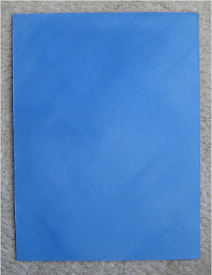
So the first thing to do is apply an undercoat colour to your painting surface. Make sure that the painting surface is sealed; apply a second coat if you need to.
Next mix a second colour with some gel retarder.
The gel retarder will slow the drying time a little, which is handy for this technique.
Try 1 part colour to 1 part retarder.
Apply thinly to the painting surface and do not let it dry. Then you scrunch up some plastic wrap (we often call it cling film in the UK). Unfold loosely so that it keeps its wrinkles.
Lightly press into the glaze and pat gently, and remove before the paint dries.
There are two important points for this stage.

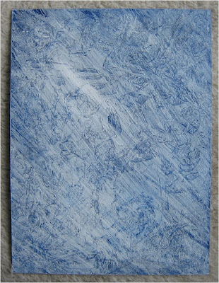
In my example I used Prussian blue and some white for the base coat, this was painted onto a canvas panel. I used a darker version of this colour for the second coat with the texture. This gave quite a delicate textured look.
However, as it was difficult to see the effect in the photo I let the second coat dry and painted a third coat using mostly white. I think you can see the texture more clearly in the photo for this one.
It's also a good example of how you can build up the texture using several coats if you want.
This is a handy way to paint in a background for a silhouette style painting, or for a graphic with a strong outline.
This idea is to seal your painting surface, apply a second coat of a different colour or tone, then place some crumpled plastic wrap on top to make a texture in the second coat of paint.
The Method
So the first thing to do is apply an undercoat colour to your painting surface. Make sure that the painting surface is sealed; apply a second coat if you need to.

Next mix a second colour with some gel retarder.
The gel retarder will slow the drying time a little, which is handy for this technique.
Try 1 part colour to 1 part retarder.
Apply thinly to the painting surface and do not let it dry. Then you scrunch up some plastic wrap (we often call it cling film in the UK). Unfold loosely so that it keeps its wrinkles.
Lightly press into the glaze and pat gently, and remove before the paint dries.
There are two important points for this stage.
- If you do not like the effect you can brush over it and try it again until you achieve an effect you like, at least until the paint dries!
- Do not press the film too firmly or you will leave finger impressions in the texture, if this happens you can refer to point one above. :-)

This technique will give a random background texture. It can sometimes look a bit like leather.

In my example I used Prussian blue and some white for the base coat, this was painted onto a canvas panel. I used a darker version of this colour for the second coat with the texture. This gave quite a delicate textured look.
However, as it was difficult to see the effect in the photo I let the second coat dry and painted a third coat using mostly white. I think you can see the texture more clearly in the photo for this one.
It's also a good example of how you can build up the texture using several coats if you want.
This is a handy way to paint in a background for a silhouette style painting, or for a graphic with a strong outline.
Monday, September 21, 2009
How to Paint a Simple Sky Video
Here is a video clip that shows how to paint a simple sky
This simple sky is an excellent starting point for a range of pictures.
There is a good rule - if you have a complicated foreground be sure to keep the sky simple. When you want to paint a 'busy' sky keep the foreground plainer for a pleasing result.
Snow Scene Using 3 Colours - 2 CD set
This video clip is the start of the video I sell showing how to paint a Snow Scene Using 3 Colours. It is an interesting project and using a limited palette is a useful technique.
If you would like to see further details on this item please go to the Learn and Do website
and click on the Acrylic Painting Course link and then the order page. The details of the Snow Scene set are further down that page.
Why do I not just put in a link directly to this page?
If I am having any problems with the website, supplies, my holiday :-) or illness then the home page is changed to the 'this website is being updated page'. This means that if there is any reason why I cannot give you the best service, you will know when you get to the home page.
This doesn't happen very often but I want to ensure that if you trust me enough to try my products that I'll give you the good service you deserve.
Subscribe to:
Posts (Atom)